
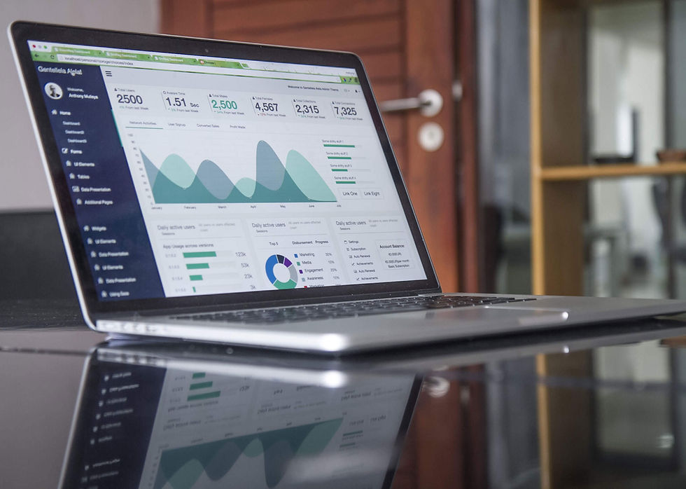
As a Data Artist, one of the biggest challenges when designing dashboards is finding the right balance between aesthetic appeal and usability. To offer excellent User eXperience, your dashboard/product should both look great and work well—not one or the other. If you tip the scale too far in either direction, you risk your audience getting frustrated with poor usability or giving your department a bad reputation due to a low-quality visual experience.
Usually, usability should be slightly prioritized over aesthetics. A great-looking dashboard is important, but if it doesn’t work well, the UX will suffer.
Over the past few years, i have heard this several times already, it was something like this :
“hey JP, here is the data that we have regarding our finance department, this new dashboard is crucial for us and we really want you to make something really “sexy”.
You read it right, client are asking for “sexy dashboard” if you look at the definition you will find this : Sexy : used to described something that attracts a lot of interest and excitement.
Making a dashboard sexy is definitely not that easy due to the fact we want to have something visually aesthetics and at the same time very usable.
Sexy : used to described something that attracts a a lot of interest and excitement.
So, when it comes to designing user interfaces, striking the right balance between aesthetics and usability is crucial. Aesthetics, or the visual design of a dashboard, can make a user interface more attractive and engaging. Usability, on the other hand, refers to the ease of use and effectiveness of the interface in helping users accomplish their goals. Think about having the right kpi, the right filters, etc… However, it's important to note that focusing too heavily on aesthetics can come at the expense of usability.
A visually striking dashboard that is difficult to navigate or use can be frustrating for users and ultimately harm the user experience. Similarly, a dashboard that prioritizes usability over aesthetics can be unappealing and uninviting to users.
Example in E-commerce websites
One example of this balance gone wrong is in e-commerce websites. Many e-commerce websites prioritize aesthetics in their product pages, using large, high-resolution images and slick animations to showcase their products. However, this can make it difficult for users to find important information such as price, product details and reviews.
Example in a coffee shop
Another example is in restaurant, where owners may prioritize aesthetics over usability in order to make their interior and materials stand out in a crowded marketplace with plenty of nice place to go and eat.

Few months ago, i went to this place in Lausanne, nice looking interior, cosy atmosphere. The first time, i saw the plate they are using to serve tarts, and desserts i said to myself : "whaou this looks good, i really like it”. I had the same feeling with the chair and bench. however, when i grab the plate i realized that the weight was ridiculously heavy and when i spoke with the waiter, she said : they are looking good, but so heavy that at the end of my day it hurts my arm so bad.
So yes, it’s aesthetics, but in term of usability it's definitely not the right approach.

Definition
The Aesthetic-Usability Effect is a well-known principle in the field of psychology that suggests that people tend to perceive aesthetically pleasing designs as being more usable than less attractive designs. In other words, people tend to assume that a beautiful design is also functional and easy to use.
How can designers incorporate the Aesthetic-Usability Effect into their design process?
SIMPLIFY
Simplify the interface: Avoid clutter and reduce cognitive load by simplifying the dashboard interface. Remove any unnecessary elements or data points that do not contribute to the user's understanding of the data. i know that this is a tricky part. On one hand you are willing to give your users a maximum of flexibility, so you are adding plenty of filters, plenty of charts but at the end of the day it is not a good approach. I know it is difficult, but think about your “value proposition” and stick to it. This value proposition needs to be your motto to decide whether or not you would like to add new filters, new kpi, etc..
VISUAL APPEAL
Leverage visual appeal: Use design elements such as color, imagery, and typography to create a visually appealing dashboard that users are drawn to. The use of aesthetically pleasing design can help to create a positive emotional response, increasing user engagement and satisfaction. But be careful here, “leverage visual appeal” does not mean using plenty of nice colors and too many fonts for your dashboard. Use only the appropriate ones to make it “appealing but not unicorn”.

CHART
Use appropriate data visualizations: Use data visualizations that are appropriate for the type of data being displayed. Use visualizations that effectively communicate the data while being aesthetically pleasing. In this area, i have made some mistakes trying to use the latest chart available or the most nicer. I remember a time when i was very enthusiast with “sankey diagram” and i was always trying to squeeze one in my dashboard.. how beautiful it was, maybe it was not the right choice.
Always refer to the FT visual vocabulary to select your chart. ;)
TEST
Test the dashboard with users: User testing is crucial to ensure that the dashboard is usable and effective. Conduct user testing to gain feedback on the dashboard's usability, ease of navigation, and overall effectiveness in presenting the data. The best way to do it, is to test it with “non user” of your dashboard. During my last Dashboard Design Workshop in Paris, i have asked a group of students to work in group and to present their dashboard to colleagues. This exercice was quite interesting for them because they have asked questions they even did not think about. So whenever you can, test with user and especially with not specialist of your field it will be even more powerful.
GO LIVE
Do not stay too long in a mockup, go live and get feedback. I have seen some examples with clients where we put lot of energy in “fine tuning” lot of details on a mockup. At some point, make it nice it’s good but we need to be able to “test and try” the mockup with real data. Because, even if as Data artits we know pretty well the different Business intelligence tools you need to stop “designing” and start implementing. I usually have 3 round of changes regarding a mockup, then i always recommend to go for a prototype.
Conclusion
In conclusion, the Aesthetic-Usability Effect is an important principle to consider in UX design. It’s always a challenge to find the right balance between usability and aesthetic but with some regular practice i am sure that you can get over it and make it successful.
By creating an aesthetically pleasing design, dashboard designers can help to improve the user's perception of the dashboard, and make it more enjoyable and user-friendly. But, we aware of the fact that adding too much functionalities will end up with a real bad experience of the user. You need to find the right balance.
Enjoy your week.
JP
Comments